HOME
TATTOO BLOG
SYMBOLS & DESIGNS
CELEBRITY TATTOOS
TATTOO PHOTOS
TATTOO MUSEUM
TRIBAL TATTOOS
TATTOO FACTS
TATTOO LINKS
The Tattoo Project - THE GALLERY SHOW
Looking back at the original photo shoot, in May, I was introduced to the twelve photographers and watched them work in various rooms scattered around the two floors of VPW’s expansive photo studio. The plan was simple—bring in 100 different tattooed people and have each of eleven photographers render images in their own, unique way. I have long been an advocate of the “no one gets the same results, even if they all use an identical camera and stand on the same X on the floor” philosophy, but these dozen photogs still surprised me. Each had a different lighting system (strobes, rings, bounce flash, etc.), several different cameras (Nikons, Canons, Leicas) and vastly different bags of technical tricks. Some photographers cajoled their models with funny patter. One demanded twisty-turny poses, another made you stand like a stick figure. One used a tripod (to guarantee a sharp image). Another shot his models purposely out of focus. One, Jonathon Vaughn, made me think he was shooting passport pictures, the way he focused his lens primarily on the models’ faces, then clicked off a couple frames of their favorite tattoo. I mean, what the heck was he up to?
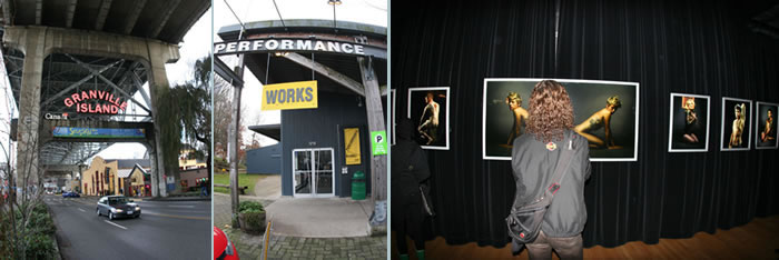
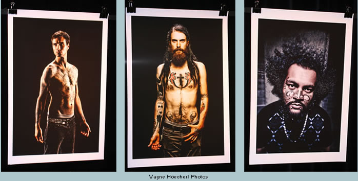
So, here we were, seven months later, pulling up in a cab in front of this boxy building in a local tourist Mecca, not knowing what to expect. A young couple pushed open the glass-front doors ahead of me and ambled down the long hallway to the gallery beyond. Paper posters and several bazaar paintings of rabbits attacking skyscrapers and such caught my attention, but the real show was up ahead with the glittering lights. I must have seen a zillion tattoo photographs during my fifteen years editing a tattoo magazine, so I am, admittedly, quite jaded. But when I entered the main doorway into the gallery, I was impressed. To my right, were brightly illuminated, three-foot-by-four-foot, full-color images on snow-white photographic paper by Wayne Höecherl. A sensational display against the black-velvet background. Held in place by black and chrome alligator clips, this first-thing-you-see placement (mounted by gallery architect Penny Lane) let us know we were in for something wonderful. As with most of the other artists’ work, Höecherl’s images were exhibited in their own cubicle, with walls in front and to either side. The lighting was superb. The photographs, especially Höecherl’s, glowed in space, enriched by the super-perfect focus and dramatic color palate of the body art.
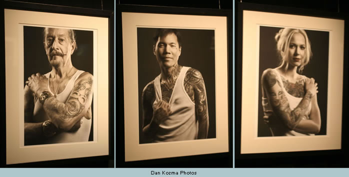
Since I am pretty much familiar with the styles of all the professional tattoo circuit photographers—Bernard Clark, Billy Tinney, Bill DeMichele, Jan Seeger and Richard Todd—I was expecting a lesser result from these photographers, most of whom, to be honest, hadn’t a lot, if any, experience shooting tattooed people. But what these photos lacked in the subtle interplay between the models and their tattoo work (tattoos are often said to “show your insides on the outside”), it was more than compensated by the sheer dramatic effect that Höecherl achieved in his eye-opening display by the main door. Just as I was admiring the method of displaying the images (white paper, metal alligator clips), I turned the corner and everything changed. Mounted with standard white mats and simple black frames, these muted, black & white images, by Dan Kozma, looked hand-painted, merely suggesting color, quietly, without letting it dominate. Shot from the waist up, these close-up portraits captured the models energy, but because of their sheer size and in-your-face focus, the subjects stared, grabbed your eyes and wouldn’t let go.
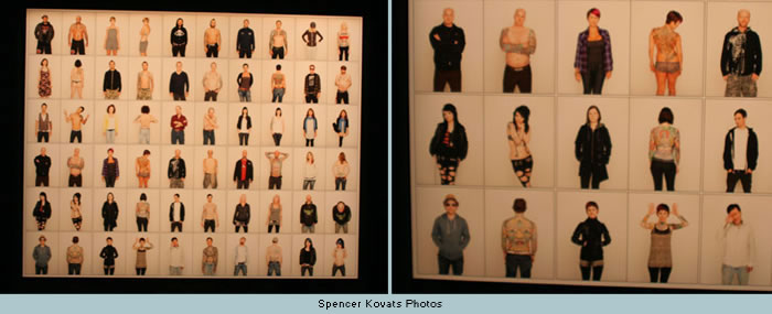
The third cubicle presented several rows, left to right, of small, black & white Polaroid images. Set in identical black frames with white matting, these images were fascinating, and a couple caught my eye, but after the dramatic presentations of Höecherl and Kozma, I pretty much drifted past these and, once I caught the image of the enormous, well-lit, single collage out of the corner of my eye, to my left, couldn’t wait and had to move on. What I saw was one of my favorite pieces in the whole show: Spencer Kovats’ four-foot-by-five collection of before-and-after shots of sixty (six high by ten wide) photos of men and women, one wearing street clothes and, next to it, one with their tattoos exposed. It’s a simple idea, but it really, really worked. The sheer joy of seeing thirty people literally come alive, when their ink was exposed, was a powerful and perfectly conceived statement of the significance and tonic of joy that tattoos add to an individual’s life. The ink was the perfect party makeup. I’ve not seen this idea executed so well and assembled in such a visually rewarding fashion. This was one piece of art that I definitely wanted to take home.
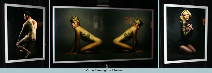
In the middle of the back wall was another powerhouse display. Although Vince Hemingson’s appearance at the Photo Workshop in May was, I thought, merely his make-a-wish chance to participate with some of Vancouver’s best (kind of a busman’s holiday), the results of his photo sessions were not only equal to his compatriots’, they were some of the exhibit’s very best work. Displayed as full-color transparencies, backlit and gallery-mounted, shadow-boxed away from the wall, Hemingson’s photographs not only supplied a welcome splash of color between two collections of relatively miniscule images (Kovats on the right and Johnathon Vaughn to the left), but the contrast against the blackness of the wall itself, shown like a neon sign, beckoning from the darkness and inviting viewers into the deep recesses of the room itself. His double panel, especially, was the perfect counterpoint to the repetitive sizes and shapes of the images posted around the rest of the room. Without belaboring the point, it is clear that Hemingson not only knows how to produce a stunning show, he has become a significant contributor, as well.
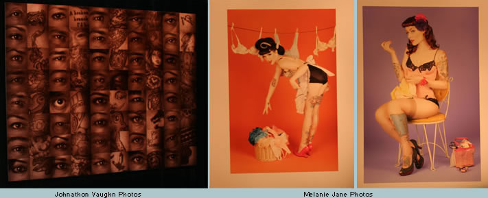
To the left of Hemingson, was the brilliant, single-panel, sepia-toned collection of eyes and art by Johnathon Vaughn. He’s the guy I thought was taking passport pictures. In fact, I didn’t have much faith that his place in a gallery show would be worth viewing. I was wrong. Assembling a collection of forty right eyes and a partial section of each model’s favorite tattoo doesn’t sound like a traffic stopper, but it was. For me, it got down to the nitty-gritty, the essence of what tattoo is all about. One eye. One tattoo. Magnetic. It was especially fun to find Vince’s eye and mine, too, among the rows and rows of pictures. It wasn’t great tattoo art and it wasn’t great portrait art, but, of all the displays on all the walls, this was the one that I kept coming back to see, again and again.
Melanie Jane’s pinup photos were to the left, on a wall that was brightly lit with overhead spots. Self-consciously posed to replicate 1950s pinups in scanty, period underwear doing dishes and ironing isn’t a new idea, and I’m not too sure it’s a very good one, having been done so much better by graphic artists like Fernando Vargas, Olivia and David Nestler, among others. I’m not sure this kind of flat lighting and retro poses works in photographs. Gil Elvgren’s hand-drawn illustrations kind of cornered the market on pretty girls in scanty clothing doing household chores, not only because of his great artistry, but also the way be maneuvered dimension and accentuated certain body parts for alluring effect. Without artistic manipulation, these photos looked rather one-dimensional and plastic. Jane should be applauded for the process but not necessarily the result. Too much about props and not enough about people and their tattoos. Quite simply, tattoos weren’t a significant element. Could it be that the show’s concept got lost in translation? Aura McKay had a completely different approach. Her photos, each and every one, were different. Here a leg, there a back. Her shots were technically good, and I’m sure the audience enjoyed these high-concept images, if only because they were so different from anything else in the room. But I think the ideas were too scattered. Perhaps the concepts (an unconnected body part, a prop) would have worked better if the photographer had narrowed her vision and created more from the heart, and not so much from the mind.
Around the corner from Aura McKay was Jeff Weddell, one of the solid, no-nonsense photographers who carried out project’s concept most effectively. Rather than adding too much to the pictures, Weddell simply displayed images of people with their tattoos and let the viewers react on their own. Although Weddell’s approach to photographing the models is similar to the photographs by Höecherl and Kozma (just models and their tattoos, without frills or added “concept”), his stark, white backgrounds and soft shadings were a unique contribution and welcome contrast to the brighter, more theatrical images of some of the other contributions to the exhibit. His models were the most introspective.
Syx Langemann took a different tact altogether. His black & white images were the perfect counterpoint to the rest of the exhibit. Focusing closely on the details of each model’s face and obscuring the tattoos themselves by using a swings & tilts architectural camera, he rendered the tattoos in a cloudy, ethereal, out-of-focus manner. A fun departure, although I’m not sure I’d run back to see more shots executed in this manner. However, for this one exhibit, just for the sake of exploration, it was a daring and unique approach. A definite standout in the uniqueness category. Great idea, excellent execution. Wrapping up the show were some fine images of the guest of honor, Lyle Tuttle, from his early days (the volunteers dispensing beer and wine were stationed nearby, in the middle, behind the stage). To the right, finishing off with splash of color, were the portraits of Rosamond Norbury , a highly professional lensmaster utilizing richly-colored backgrounds to turn the predictable subject matter into glorious art. While Höecherl, Kozma, Langemann and Weddell posed their subjects in straightforward, here-we-are, take-a-look poses, and Hemingson treated his subjects in a more respectful, painterly fashion (after all, he was the one photographer with a significant understanding of the “tattoo as fine art” concept), Norbury tended to pull more personality from the images, by adding her own technical body-English. More of the same, yet so different. And who was the winner? The nearly 1000 people who had an opportunity to share in a dream that Vince Hemingson brought to life before their eyes, that’s who. This was not an easy project to actualize. Knowing how these far-reaching projects go, I’m sure there were lots of backroom shenanigans and shows of artistic temperaments that Hemingson had to deal with, not to mention the obvious expense in producing a showcase that one critic remarked was “equal to anything in New York galleries.” A justified compliment, for sure, and all the more incentive to stay tuned to the future of this project (Vince already printed a calendar, which sold like proverbial “hotcakes” at the event). A coffee table book, a television special, a film festival entry? All in the cards, I’m sure. Proving that, with dedication, world-class taste and a love of tattoo, on that Friday night in November, Hemingson and his crew made dreams happen. Well done, Vince. Well done. —Bob Baxter As editor in chief of Skin&Ink magazine for over fourteen years, Bob Baxter guided the publication to a Folio Magazine Editorial Excellence Award, making it America’s most respected and educational body art publication. He currently edits and writes a Daily Blog at www.tattooroadtrip.com, the ultimate E-zine and resource site for international tattoo artists and collectors. He also has his Tattoo Chronicles series and the 101 Most Influential People in Tattooing right here @ Vanishing Tattoo. To ask questions, make comments or demand an apology, you can email Bob at baxter@tattooroadtrip.com. |
 By Bob Baxter